
Succinctly and precisely explaining key data points in your chart can be hard using native Excel. Our chart label editor and CAGR arrow functions are designed to make it easier to produce charts for your audience to understand at a glance.
Add a CAGR arrow to existing charts
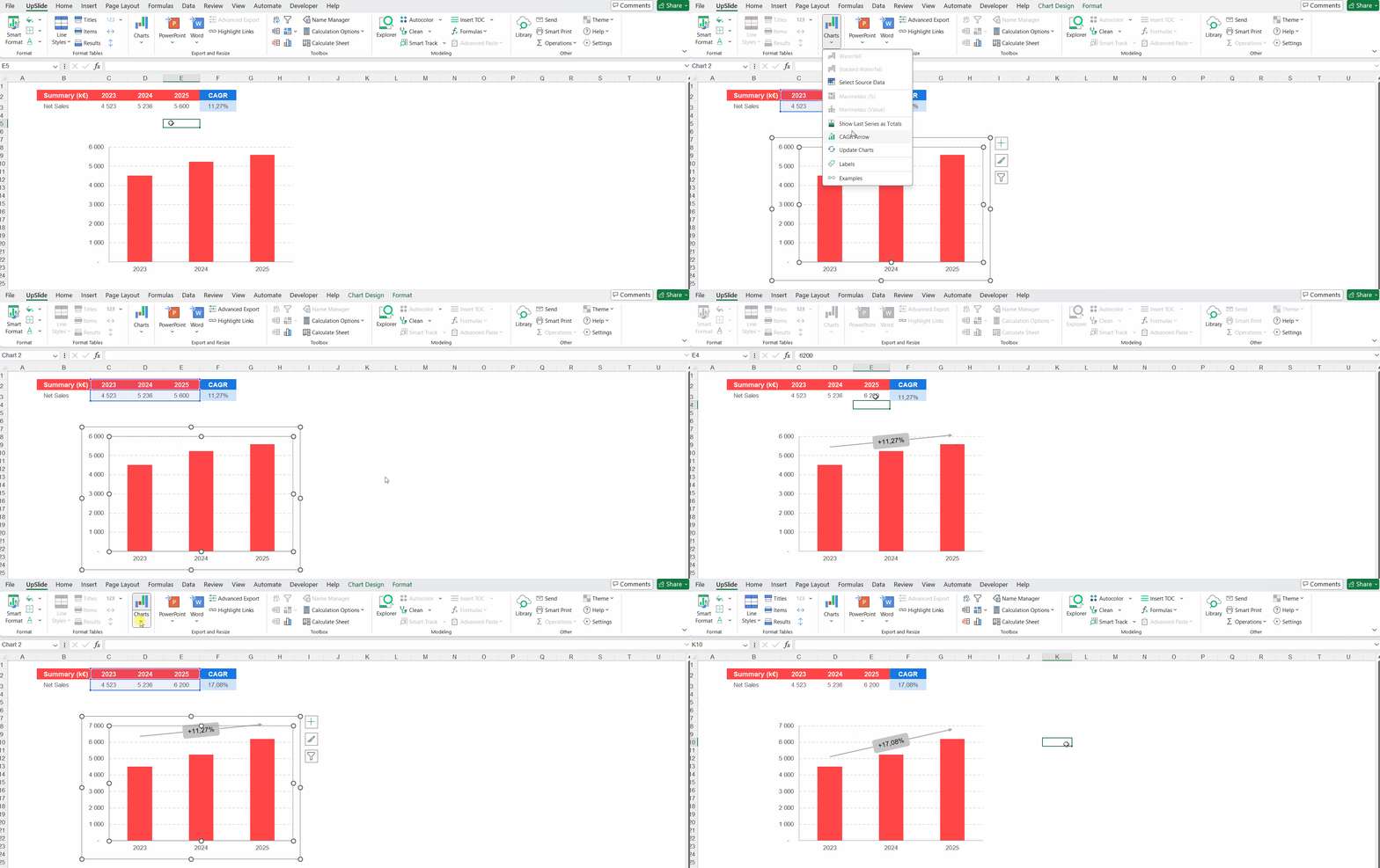

CAGR arrows can be used to display the compound annual growth rate between the first and last points of the selected chart. To display a CAGR Arrow:
- Select your chart.
- Open the Charts drop-down.
- Click CAGR Arrow and click Apply.
When you update the chart source data, the CAGR is not automatically updated. To do so, you can either reinsert the CAGR on the chart, or click the Update Charts button. If no chart is selected, this button will also update all the CAGR boxes found in the workbook.
You can also separate your CAGR arrow into several segments:
- Click CAGR Arrow in the Charts drop-down menu.
- Select the start and end positions of the CAGR arrows using the dropdown menus and click the plus sign to add more.
- Click Apply when you’re done.
For stacked and standard Waterfalls, the number of years is automatically adjusted to the number of ‘pillars’.
Adding last series as a total data label(s)
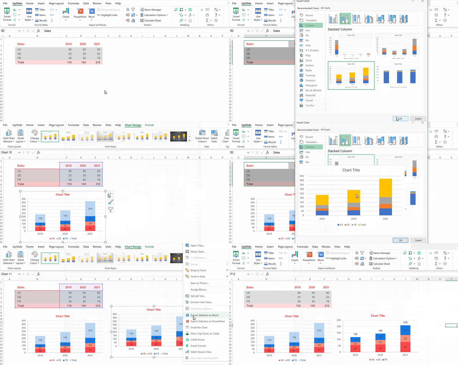
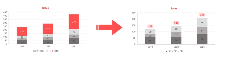 Instead of presenting totals as their own block in your stacked bar chart, you can use UpSlide’s Show Top Series As Totals feature to present your totals as a data label at the top of each individual stacked bar.
- Insert a stacked bar chart
- Add data labels
- Right click on your chart, and select Show Top Series as Totals
Custom data label content and positioning
In the Charts drop-down when a chart is selected, our Labels feature speeds up the process of labelling data on charts. It allows you to insert, change and move all of your data labels in a few seconds which then remain dynamic and adapt as your source data changes (e.g. if your data scale changes they remain 10 pixels above the bars on a chart). Using the Data Label Editor, you can do things that are very difficult using Excel:
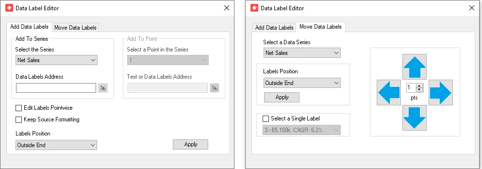
- Modify data labels points-wise or series-wise
- Link data labels to the content of a table (or a cell when dealing with a single point)
- Move your labels using native Excel options or change their position by a given increment

E.g. in this .gif it shows a custom label set at a different position to other labels. The relative position is retained when the data is changed and scale of chart updated.

Adding data labels to a whole series
Similar functionality to newer versions of Excel but with fewer side panels to navigate.
- Select your chart
- On the UpSlide toolbar the Charts button has a dropdown (the button may be greyed out but you can still use the dropdown)
- On the dropdown select Labels to open the label editor
- Under Select the Series dropdown choose the series you want to add labels to (this step is only necessary when your chart has multiple series present)
- Use the range selector to choose the cell contents you want to display, press enter to return to the label editor
- Click apply and close the label editor window to see the change (you can then add further modifications to the labels such as formatting)
Adding custom labels to specific data points in a series
Creating and controlling custom point labels in one place for a chart. Assuming you already have labels applied to the series:
- Open the label editor
- If you have multiple series of data in your chart use Select the Series and choose the series in which you have the label you want to customize
- Tick Edit Labels Pointswise and the area to the right will become available
- Using the newly available dropdown choose the individual point in the series you want to have a custom label compared to the rest of the series
- Use the range selector to choose the cell contents you want to display
- Use the range selector to choose the cell contents you want to display, press enter to return to the label editor
- Click apply and close the label editor window to see the change (you can then add further modifications to the label such as formatting)

Adding data label(s) to a subset of a series - i.e. labels different to the others
In this example we are adding just one label to a chart but you could do this for multiple points in a series. Follow the instructions above adding custom labels to specific data points in a series. In this .gif you see that the labels and chart still updates when the data changes when using our label editor.

Moving a whole series of data labels
Maintaining a consistent relative position of your data labels is made easy by:
- Selecting your chart and opening the label editor
- Go to the Move Data Labels tab in the window
- Select the data series you want to move
- You can adjust the overall position e.g. to centered on the bars, at the bottom of them etc) or move them by custom points
- Enter the number of points you want the labels to move and then press the arrow in the direction
- Close the window to see the effect on the chart

In our example .gif we show you can ‘stack’ different movements without closing between each type. In this case moving them down 10pts and left 5pts at the same time.
Moving specific labels differently to the rest of the series
- Selecting your chart and opening the label editor
- Go to the Move Data Labels tab in the window
- Select the data series which contains the label you want
- Choose Select a Single Label and in the dropdown choose the data point you want to apply a custom position to
- Enter the number of points you want the labels to move by and then press the arrow for the direction of movement
- Close the window to see the effect on the chart